PRODUCT DESIGN, DISCOVERY & USER RESEARCH
Chartbeat Reports
Turning analytics into actionable newsroom intelligence.
- Role
- Lead Product Designer
- Year
- 2017
- Focus
- Product Strategy · User Research · Experience Strategy · Systems Thinking · Cross-functional Leadership · Product Discovery
- Team
- Product · Design · Data Science · Engineering
Overview
In 2017, Chartbeat identified an opportunity to better serve the Analyst role within news organizations by expanding its reporting capabilities.
Competitors already offered more robust reporting tools, putting Chartbeat at a strategic disadvantage. But our research revealed an opportunity to differentiate: rather than simply replicating traditional analytics reporting, we could create reporting specifically designed around the publishing workflow.
The challenge was not simply what data should we show? It was:
How might we make analytics more useful and actionable for people working in a newsroom?
I led the research and experience strategy that helped the team understand who we were designing for, what they were trying to accomplish, and where Chartbeat could create the most value.
The challenge
Newsrooms were already surrounded by data. The problem was that getting meaningful information out of that data often required significant effort.
Editorial leaders needed to understand how their content was performing and what they could do differently, but many didn't have an analytical background.
At the same time, editorial analysts had the analytical expertise—but were spending much of their time answering repetitive questions from newsroom teams.
Questions like:
“What were my top stories yesterday?”
“How did we perform compared with the past?”
“What topics are resonating with our audience?”
“How can we build a more loyal audience?”
This created a cycle where analysts repeatedly pulled, interpreted, and contextualized basic information for others.
The opportunity wasn't simply to provide more data. It was to reduce the distance between data and understanding.
Discovery
Understanding the people behind the data.
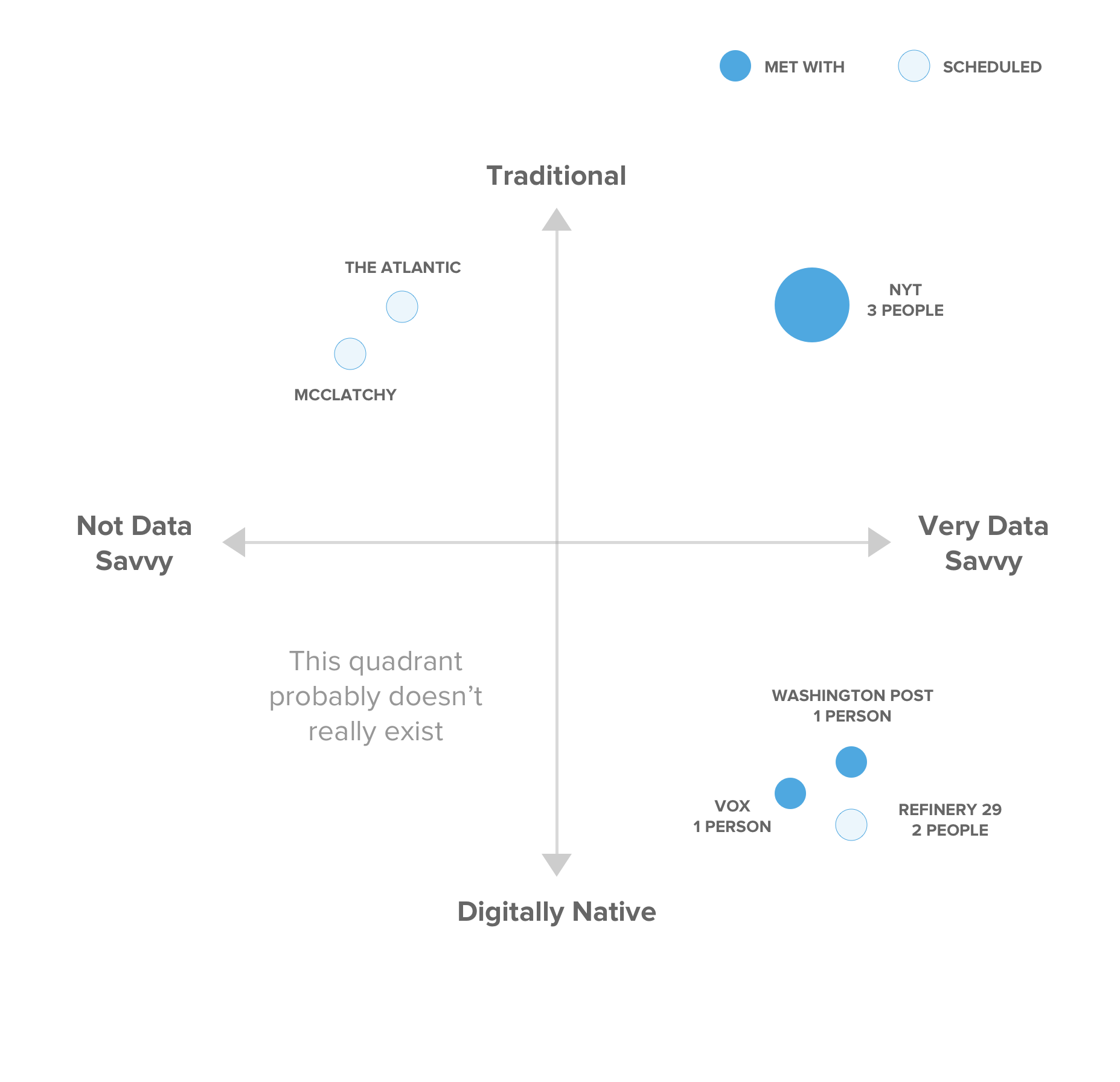
I led user research with organizations that varied in both data maturity and organizational model.
We intentionally recruited organizations ranging from less data-savvy to highly data-driven, as well as more traditional publishers and digitally native organizations.
Our research focused on understanding:
- 1
Who would benefit most from a reporting solution?
- 2
What questions were they trying to answer?
- 3
How were they answering those questions today?
- 4
What did their existing reporting workflows look like?
- 5
Where were they spending unnecessary time?
- 6
What kind of experience would actually fit into their day-to-day workflow?
This helped us move beyond designing for a generic “analytics user” and understand the different jobs people were trying to accomplish.
Defining the users
Two audiences emerged.
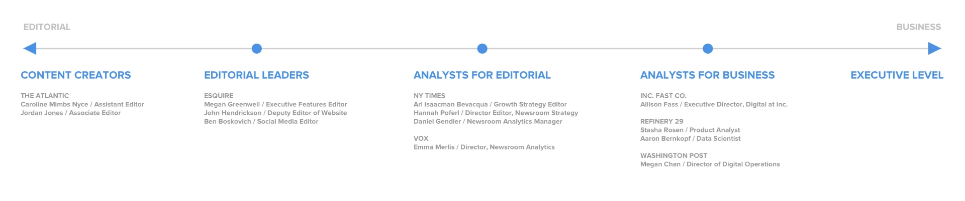
Our research identified several personas spanning editorial and business roles. We ultimately saw the strongest opportunity in two editorial audiences.
Audience 01
Editorial Leaders
Former content creators who had moved into leadership positions.
They were increasingly responsible for using data to guide teams, but often didn't have the analytical background to navigate complex data products or translate raw metrics into meaningful insights.
They needed
Accessible, contextual information that helped them understand performance and make better decisions.
Audience 02
Analysts for Editorial
Highly analytical users who were comfortable with complex data tools.
But their expertise was being consumed by basic, repetitive requests from the newsroom.
They needed
A way to democratize basic reporting so they could spend more time doing the deeper analysis they actually wanted to do.
The tension
The two audiences had different needs, but they pointed toward the same opportunity:
Make useful reporting accessible enough that more people could answer their own questions.
From research to experience strategy
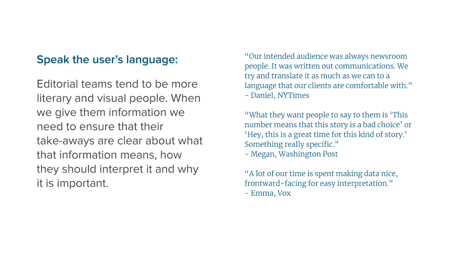
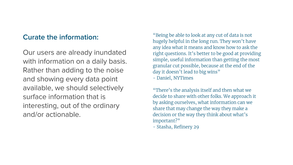
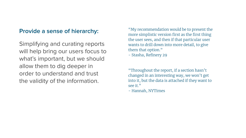
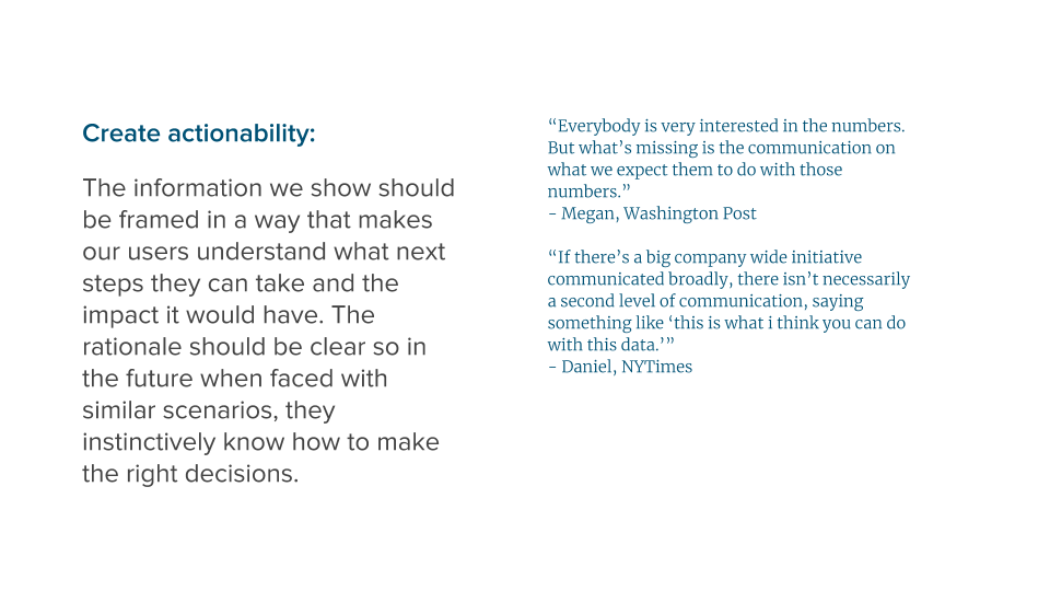
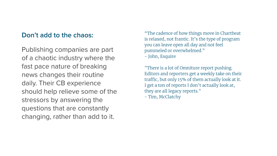
Rather than jumping directly into screens, I helped translate our research into a set of experience principles. These principles became a bridge between what we heard from users and the decisions we would eventually make about the product. This gave the team a shared framework for evaluating potential ideas.
Experience principles
Cross-functional ideation
Designing the product with the team—not in isolation.
I partnered closely with Data Science, Engineering, and Product to explore what reporting could look like. One of our working sessions focused specifically on defining what information should appear in a Daily Site Report, intended to replace an existing experience called Daily Content Perspectives.
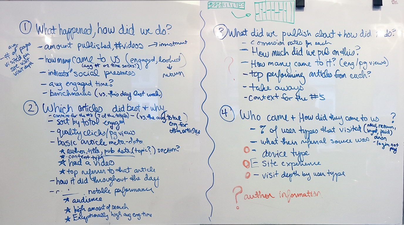
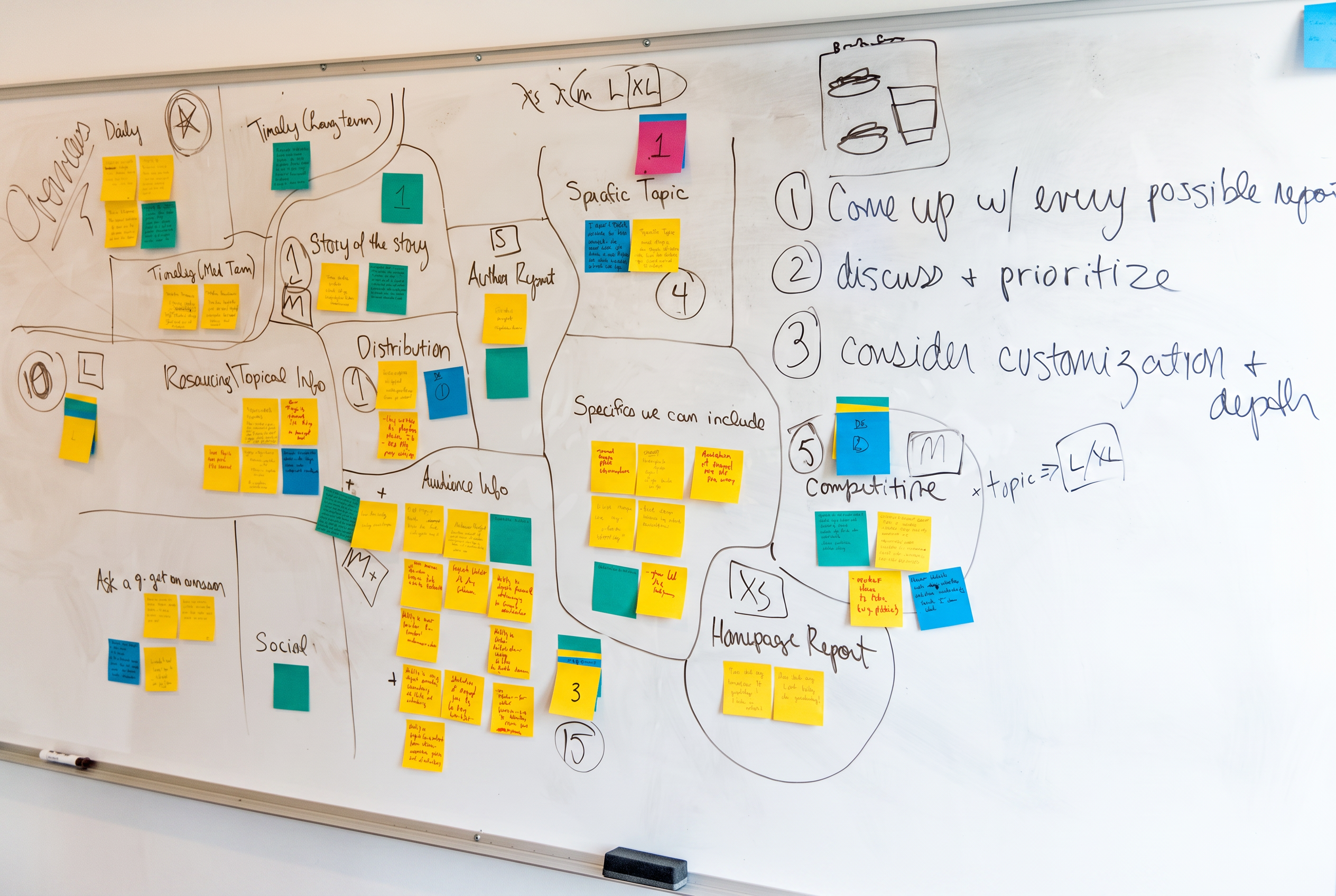
Brainstorm on what the Daily Site Report could contain.
We also held a broader workshop to map the universe of potential reports. To turn our broad strategic opportunity into a focused MVP, we evaluated ideas against two dimensions:
User value
How strongly did the idea address something we heard in research?
Technical complexity
How feasible would it be to build?
The product strategy
Start with the moments that mattered most.
Rather than attempting to build an exhaustive reporting suite, we prioritized the reports most directly connected to common newsroom workflows.
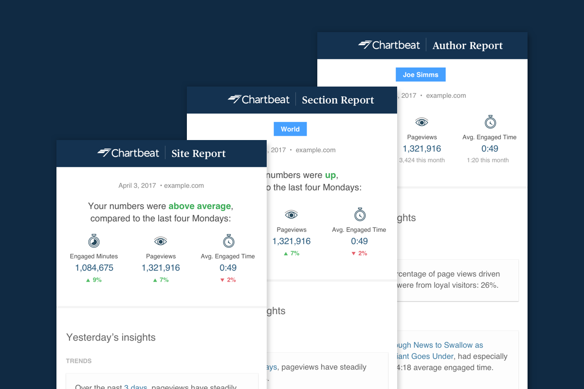
The MVP focused on three report types:
01
Daily Site Report
A view of overall site performance.
02
Daily Author Report
Performance information organized around individual authors.
03
Daily Section Report
Performance information organized around sections of the publication.
Together, these provided multiple ways for newsroom teams to understand performance without requiring an analyst to manually assemble the information.

01 / 05
A top-level overview
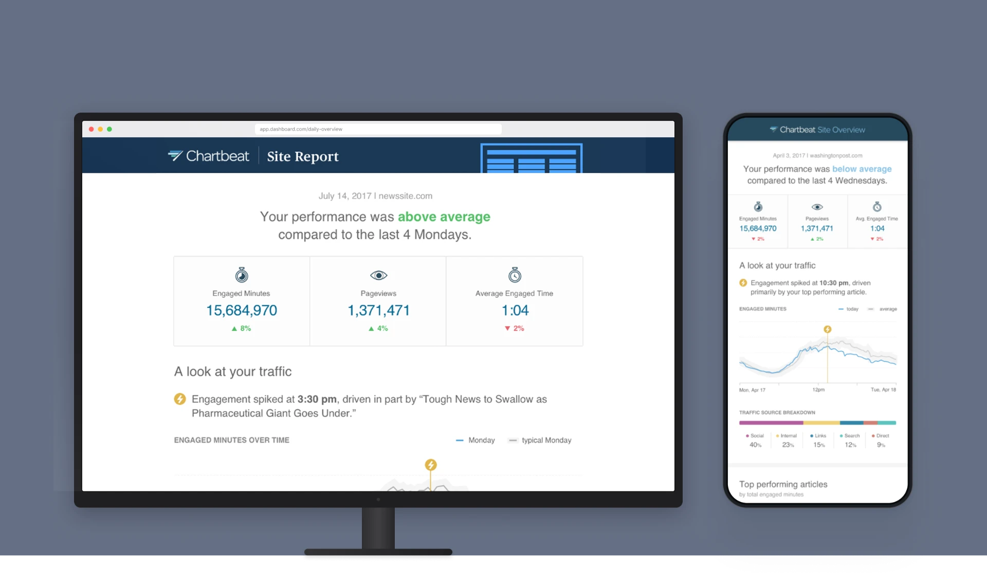
A top level overview lets users quickly see at a glance what their performance was like the day before.
Designing for the workflow
Why email?
We considered not only what the report should contain, but where and when users would encounter it. Research indicated that a common use case for a daily report was checking performance first thing in the morning—often from a phone.
That led us to deliver the reports through email, rather than requiring users to proactively enter the product every day. A corresponding desktop experience allowed users to subscribe to the reports.
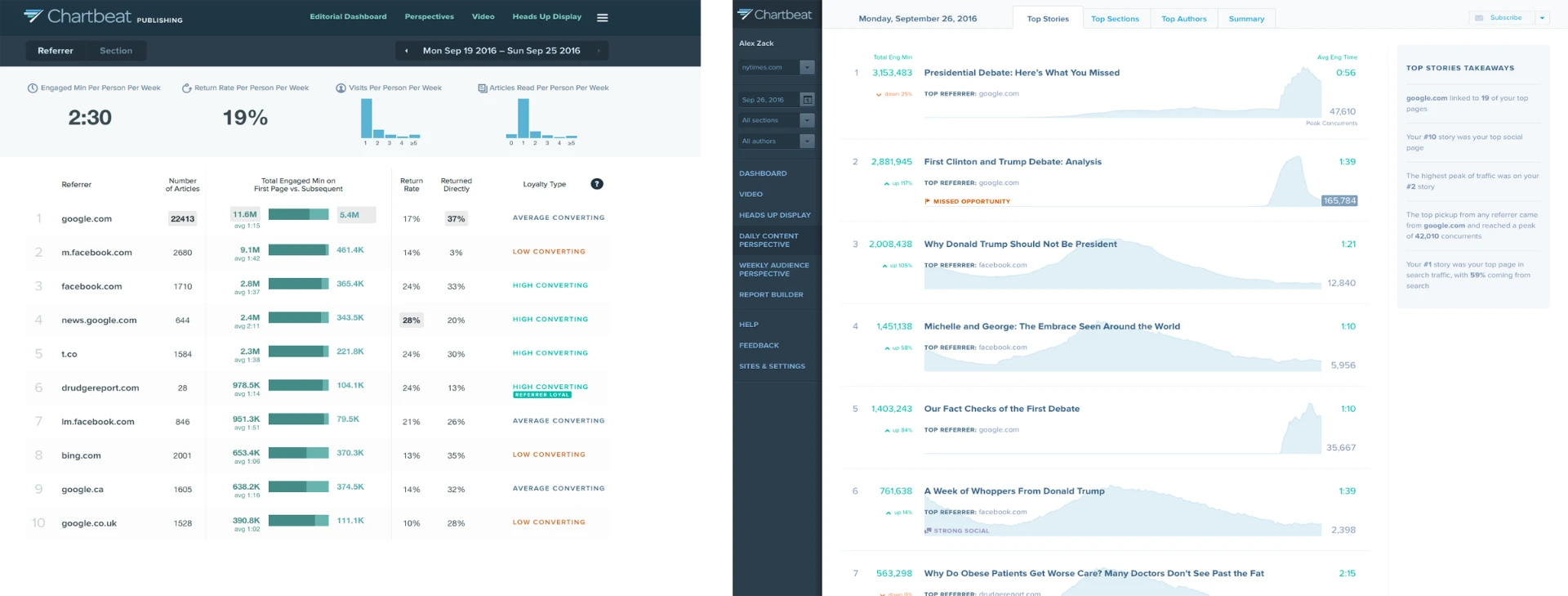
Previous reporting solutions lived within product dashboards, but research revealed a need for reporting that better fit users’ mobile-first morning workflows.
The best analytics experience isn't always another dashboard. Sometimes it's information arriving in the right place at the right time.
Outcome
The team launched the Daily Site, Author, and Section Reports as the MVP and continued exploring weekly reports and more topical reporting experiences.
More importantly, the work established a broader direction for Chartbeat reporting:
Move from giving users access to data toward helping them understand and act on it.
What I brought to the project
This project reflects how I approach complex product problems:
My role wasn't limited to designing the interface. I helped the team understand the problem space, identify the highest-value users, establish experience principles, facilitate cross-functional exploration, and translate research into an MVP strategy.
The result was a reporting approach designed around the end-to-end newsroom workflow, rather than simply adding more analytics capabilities.
Reflection
“The best analytics experience isn't always another dashboard. Sometimes it's information arriving in the right place at the right time.”